Strange Squadrons Design
By Chris Kalb
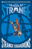
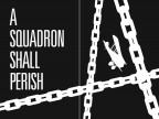
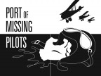
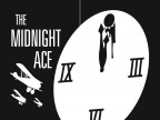
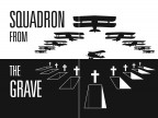
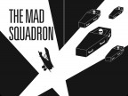
In the same way that The Spider Vs. The Empire State was meant to evoke the pulp era without being designed like a pulp magazine, our Captain Philip Strange series is a tribute to the great pulp-reprint era of the Sixties, which Philip Strange never got to be a part of. From the sci-fi-tinged logo and warped type, to Strange’s resemblance to ubiquitous cover model Steve Holland, hopefully the cover wouldn’t be out of place on an old drug store rack. For each story we’ve downplayed the Eugene Frandzen art from Flying Aces in favor of new Saul Bass-flavored frontispieces. Tackling a public domain property, we felt we needed to put our own unique spin on it and give the reader a good reason to pick up our version.
- A Squadron Shall Perish
- Port of Missing Pilots
- The Fokker Fiend
- The Midnight Ace
- Squadron from the Grave
- The Mad Squadron
Click here to view Chris’ designs for the previous titles in the Captain Philip Strange series—Strange War, Strange Enemies, Strange Operators, Strange Staffels, Strange Spectres, and Strange Hell. Several of Chris’ designs are availbale to download as desktop wallpapers from our Age of Aces Desktops Gallery page.


