Strange War Design
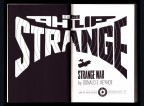
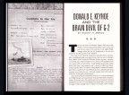
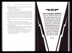
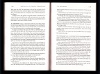
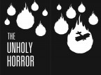
In the same way that The Spider Vs. The Empire State was meant to evoke the pulp era without being designed like a pulp magazine, Strange War is a tribute to the great pulp-reprint era of the Sixties, which Philip Strange never got to be a part of. From the sci-fi-tinged logo and warped type, to Strange’s resemblance to ubiquitous cover model Steve Holland, hopefully the cover wouldn’t be out of place on an old drug store rack. For each story we’ve downplayed the Eugene Frandzen art from Flying Aces in favor of new Saul Bass-flavored frontispieces. Tackling a public domain property, we felt we needed to put our own unique spin on it and give the reader a good reason to pick up our version.
- Front Cover
- Back Cover
- Title Page
- Teaser
- Combats Form
- Blurb Pages
- Splash Page
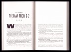
- First Chapters
- Text
- Scourge of the Skies
- Cocardes of Courage
- The Drome of Dread
- The Red Demon
- Vengeance of V-99
- The Unholy Horror
Several of Chris’ designs are availbale to download as desktop wallpapers from our Age of Aces Desktops Gallery page.


